Published July 2021 Version 0.1
| Version | Date | Author | Comments |
| 0.1 | 18 Jun 2021 | Jake Favell | Initial Draft |
Contents
- Introduction
- Installation
- Administrators Console
- Database Configuration
- Global Users
- Fields
- Tables
- Buttons
- Forms
- Types
- News
- Theme
- Notifications
- Product Links
- Teams
- Yammer (now Viva Engage)
- Reports
- Customer Info
1. Introduction
This document provides instructions for managing the edison365businesscase module and covers administrative tasks related to module configuration for administrators.
The audience for this document is the edison365businesscase Administrator.
2. Installation
The Business Case module requires two prerequisites as detailed in the product description document:
- Azure SQL Database.
- At least S1 tier but the database usage should be monitored and scaled as required.
- A SharePoint Online Modern Team Site Collection to deploy the module to.
The user installing the module on the new site collection will require Site Collection Administrator privileges as they will be the only users who have access to the Business Case module initially. This user accessing the module for the first time will be advised about SharePoint artefacts that will be deployed to the underlying SharePoint Online site collection to support the Business Case module.
3. Administrators Console
The Administrator’s Console is accessed via the cog icon in the top right corner next to the user profile. The Admin cog navigates to the admin home page. Below is a screenshot of the edison365businesscase admin homepage.

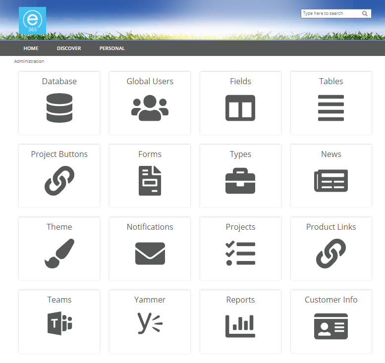
Clicking each tile will take the administrator to the respective page for the configuration option.
4. Database
Before the Business Case module can be used a database must be assigned. To do this ensure a valid Server Address, Port, Database Name, Database Account, and Password is entered. Should any of the database configuration be invalid the database updates will not save or update.

Occasionally a Business Case module update may include a database schema update. If this occurs edison365 will ensure communications will be sent to give notice of the change. To update the database schema an 'Upgrade' button will be added to the edison365 Database Status section of the page.
Caution: This can take some time so it may be best to upgrade any schemas outside of core business hours to ensure minimal impact on users.
Warning: With any schema updates it is essential to ensure a backup of the database is saved before the Upgrade button is clicked.
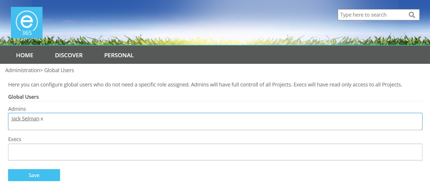
5. Global Users
This area of the module is used to control and assign roles for users on a global level. They are broken down in 2 roles: Admins, and Execs. An Admin is an administrator who has full access to all aspects of the Business Case module. An Exec is a user who can view all Business Case data in the module.
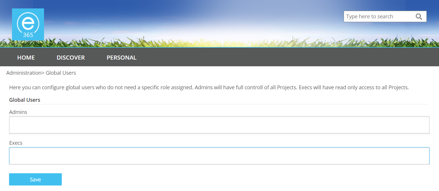
To add a user to a role click on the box for the desired role and enter the name of the user. This will search for all possible users who match the criteria used.

Once the user is selected their name will be added to the field. Once all of the desired users are added or removed click the Save button.
5a. User Profiles
When assigned to a Business Case role that user will be granted Read permissions on the SharePoint site and the role(s) given when setting up each type will used when viewing the application.
Administrators (Admin Global User)
Members of this group can access the edison365businesscase administrator settings. These users have full control across all functionality.
Owners
Members of this group can create business cases for a specific Business Case type(s). The assigned business case owners can also edit the business cases where that user is the business case manager.
Process Managers
Members of this group can fully manage any business cases for the types they are assigned to. They have the ability to edit a business case, create versions, progress the business through the stages and assign reviewers.
Reviewers
Members of this group can view a Business Case in full and provide feedback on the Business Case to approve, reject, or ask for further details on a Business Case that they have been added to as a reviewer. If the Type allows it they can also edit a Business Case they are assigned to.
Viewers (Exec Global User)
Members of this group can view all Business Cases in a read only format for all Business Case types.
Below is a visual guide to show each role and the functionalities that role can carry out.
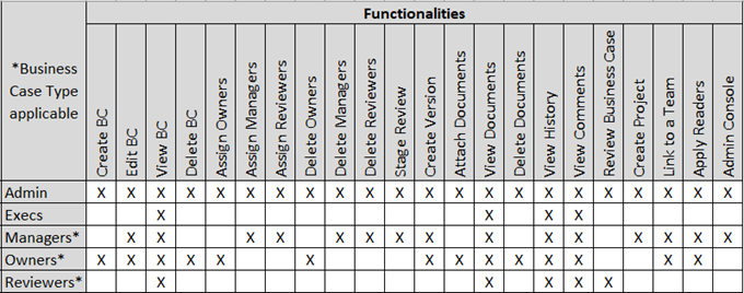
This permission matrix can be used to determine the roles required.
Back to Home6. Fields
This is the section fields can be created and managed. Fields can be sorted by clicking on the column headers. They can also be filtered by placing the cursor towards the end of the column header which will generate an icon of 3 lines. Click on the icon to open the column filter options. You can also decide to view either System generated fields or Custom fields on an individual basis.
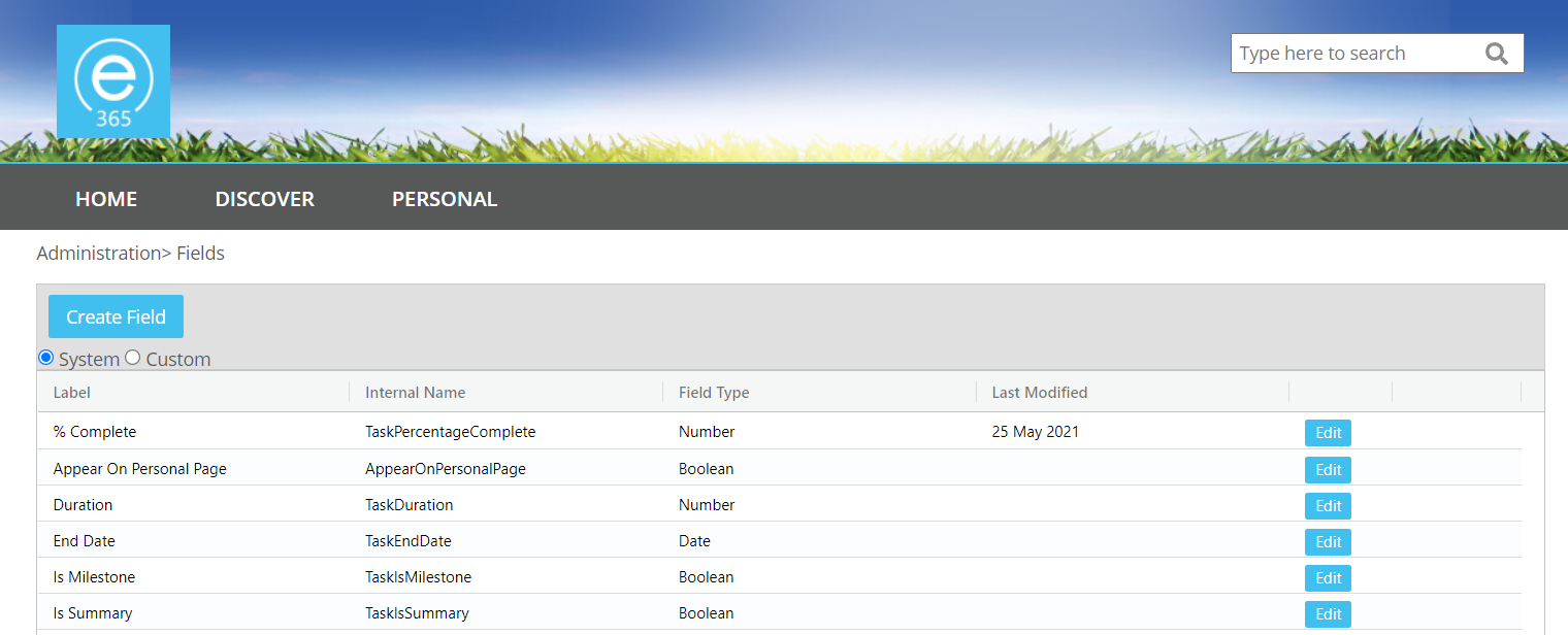
To create a new field click on the Create Field button. This will open the Create Field modal.

Once the window is opened simply enter the name for the field in the Label field which will automatically assign the Internal Name field which cannot be changed. The Field Type can also be changed to any of the below.
- Textbox – A basic text box which can be configured to allow single or multiple lines and a specific amount of characters.
- Rich Text – A textbox field with full formatting options.
- Number – Number fields can be configured to be a basic number field, a percentage, or for a currency. They can also have decimal places and a minimum and maximum value configured.
- Choice – A dropdown field which can be either a single or multiple choice field.
- Multi-Level Choice: Choice field with multiple layers. Values must be set before additional layers can be added. Can be set as single or multi select.
- Date – A basic date picker field.
- Switch – A simple switch field which can have the positive or negative values configured.
- URL - A field where a URL can be set.
Each field type has specific configuration options too. These are dependant on the different field types.
To Edit a field simply click on the Edit button next to the relevant field which will open the Edit Field window with the existing data pre-populated. Likewise clicking the Delete button will display a confirmation message and clicking Yes will delete the field.
When editing a field the field type and specific configuration options cannot be edited.
If you add text to the Description configuration field the field created will have a new icon to the right of it and when a user clicks on this the text entered will be displayed to the user. Use this feature to include some additional information as to what the field is to be used for. The same field will also be available for the Tables.
7. Tables
This is the section where tables can be created and managed. tables can be sorted by clicking on the column headers. They can also be filtered by placing the cursor towards the end of the column header which will generate an icon of 3 lines. Click on the icon to open the column filter options. You can also decide to view either System generated fields or Custom fields on an individual basis.
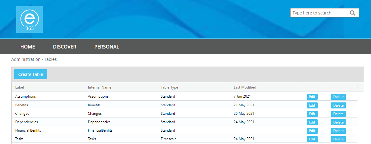
To create a table click on the Create Table button. This will open the Create Table modal.

From this modal you will need to enter name for the table in the Label field. This will also automatically populate the Internal Name field. You may also want to provide further information for users to explain what the table is used for. To do this enter some text in the Description field which will display by hovering over the icon next to the table name when assigned to a form.
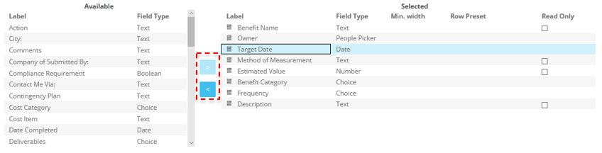
To select which fields are used on the table you can either double tab the field name from the Available field list or single click the field name and click on the button next to the list with an arrow pointing to the right. To remove a field you can double click the fields in the Selected field list. You can also single click on the field in the Selected list and click on the arrow button pointing to the left.
The next configuration option to select is the table type. To determine which table type is used click on the table type field which will open a dropdown of table types. This consists of the following types:
- Periodic – This type of table is used when time phased data is required with the table items
- Standard – This type of table is used when a list type table is required
- Task – This type of table is used to capture tasks, this includes a timeline view with a Gantt
- Aggregated Totals – This type is used to calculate data from multiple periodic tables also assigned to a form.
Each table type also has a set of additional configuration options based on the table type selected.
- Periodic
- Period Units - Time the data for the table is broken down on the table. These can be set as Monthly, Quarterly, or Yearly.
- Default View - This setting will set which view is used when the table is shown when displayed on a form. This can be set as Periodic which is the view that the numeric data for the table. Or Details which is used to set the supporting data.
- Data Type - This setting is used to decide the main purpose of the data entered in the Periodic view. This includes Cost (for financial data), Effort (for resource related data), and Material (for stock or similar data)
- Period columns minimum width - Minimum width the columns of the Periodic views are displayed
- Totals column minimum width - Minimum width of the Total Column at the end of the Periodic columns
- Grand Total column minimum width - Minimum width of the Grand Total column at the end of each periodic view.
- Standard - None
- Task - None
- Aggregated
- Tables title column min. width - Minimum width set to display the names of the tables included in the Aggregated table.
- Period columns minimum width - Minimum width the columns of the Periodic views are displayed.
-
- Grand Total column minimum width - Minimum width of the Grand Total column at the end of each periodic view.
- Calculated Rows - This is where the calculations of the table are created. You will have the ability to decide which tables from the selected tables are used and an addition or minus subtraction operation assigned. For example you could have Table A + Table B which would display the calculation in the Aggregated table.
Once you are happy with the configuration you can click on the Save button which will complete the creation process. Should you need to edit a Table click on the Edit button for the desired table from the tables grid. If you no longer require the table you can click on the Delete button for the desired table from the tables grid.
Warning: If you delete a table it will be removed from any forms and types it is associated with along with any data from any existing business cases.
8. Buttons
The Project Buttons is where you can create buttons that can be added to a Form which when clicked by a user will open a URL in a new tab. These can be used to allow an external page to be accessed directly from the Project. The buttons will require a name, URL, and an optional icon.
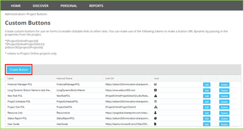
To Create a button, click on the ‘Create Button’ button which will open the following window.
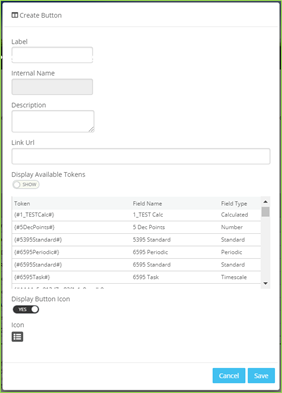
The details entered in the Label field will be displayed as the Button Name which will also automatically set the Internal Name in the same way when a field or table is created. If you include a Description this will be included as a tooltip when the button is added to a form. The final thing to configure the button is to include the URL for the button to use.
If your edison365 Projects instance is linked to an instance of edison365 Project Online DataStore and PWA is configured a set of tokens will be included to use which will allow you to automatically include the links from PWA. If an external project is created and a button uses the tokens when clicked the external project will be opened.
These will be available at the top of the list of Tokens. To view the tokens ensure the switch for ‘Display Available Tokens’ is set to Show.
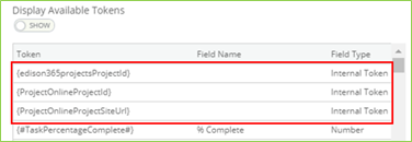
The remaining tokens are the current field set configured in your edison365 Projects instance.
The final optional configuration is the Icon to display on a button. Before an Icon can be selected ensure the Display Button Icon switch is set to Yes which will display an icon. To change the icon click on the icon displayed

Once clicked the following modal will be displayed where you can select a new icon.

Click on the Icon to use which will close the modal and the new icon will be displayed. Once the configuration is completed click the Save button which will add the new button to the Grid and is now available to be added to a Form. Please note a button cannot be added to a Table.
Back to Home9. Forms
The Business Case module allows a form template to be created which can be used across all Business Case types. The form designer used to create a form is broken down in 3 sections: Zones, Fields, Tables, and Buttons.

You can include tabs to a Form to allow the Business Case to be broken down in sections. You do not have to add any tabs to create a form, but it is down to your business requirements. If you click on the Add Tabbed Zone option in the Zones section, the following is displayed. A maximum of 8 tabs can be included. If a tab is added it will be displayed as follows:

To change the name of the click on the cog icon under ‘label’ which will open the Tab Settings and enter the desired name for the tab.
If a tab is no longer needed simply click on the bin icon. Any fields to the zones added on a tab will also be deleted and added back to the Fields list.
If multiple tabs have been added to a Form, they can be rearranged by clicking the right and left arrows.
Before any fields, tables, or buttons can be added at least 1 zone has to be added to the Form Designer. If a field is added without any zones an error message is displayed.
The zones are broken down in 5 different formats:
- One Column Zone
- Two Column Zone
- One Third Two Thirds Zone
- Two Thirds One Third Zone
- Three Column Zone
When a zone is selected it will be displayed in the Design Surface in a blank format.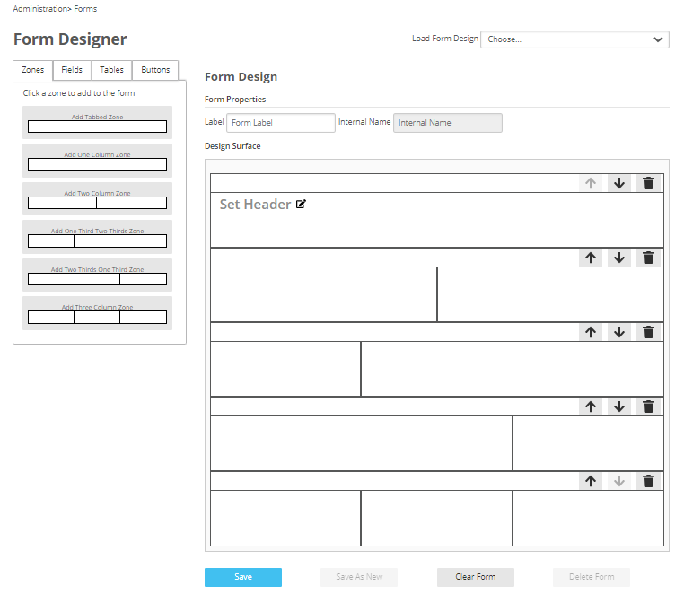
The zone order can be changed using the up / down arrows in the zone heading. Once all the Zones required have been added the next thing to do is to add any fields, tables, or buttons to the zones added. Click on the Fields tab on the Form Designer to display all the fields created in the Fields section. These are broken down by the field type (Boolean, Calculated, Choice, Date, Multi-Level Choice, Number, People Picker, Project Online, RAG Status, Rich Text, System, Text, and URL).

To add a field, table, or button to a zone drag and drop the field, table, or button to a zone. Once one is added it cannot be added to another zone on the same form.
Once the zones, fields, tables, or buttons have been added to the Design Surface a name will be needed for the form. To add a name, click on the Label field above the Design Surface area and enter a name. Once added the Internal Name field will be automatically populated with the name entered minus any spaces.
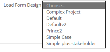
Once saved a form can be accessed in the form designer and managed to keep it up to date should any changes be needed. Click on the Load Form Design and all forms created will be displayed.
Single Column Zones can have a header included in them to help grouping of fields. When a single column zone is added to the Form Designer text labelled ‘Set Header’ will be added along with an edit icon.
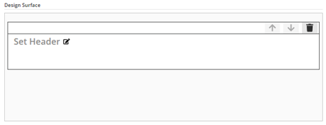
If you click on the edit icon next to the ‘Set Header text a window will open where the header can be set.

When a header has been added close the window and the text entered will replace the ‘Set Header’ text and will be used throughout the form. If the ‘Set Header’ text is not changed a header will not be used on the zone.
When a form is selected all the Zones, Fields, Tables, and Buttons will be loaded in the Design Surface. From the Design Surface all zones and their contents can be deleted, moved up or down in order.
Once a form is completed the following actions can be carried out to manage the form:
- Save – When a change is made to a Form this will overwrite any previous versions.
- Save as New – When a change is made to a form and the Label is also changed this will save the Form and keep the previous version.
- Clear Form – This will remove all Zones, Fields, and Tables from the form.
- Delete Form – The form will be removed from the available forms.
If a field or table configuration has been updated and that field is used on the form, if those changes are required on the form, access that form and click yes when prompted to include the field changes to the form. If the change is then required in the business case type, the business case type will need to be edited – see the business case type section for details.
Back to Home10. Types
The Business Case module allows multiple types of business cases to support a business case for different processes or departments. The roles set in each type will also control the permissions to the application for the Owners, Process Managers, and Reviewers.
To create a Business Case type, click on the Create Type button which will open the following page (page not displayed in full in screen shot).
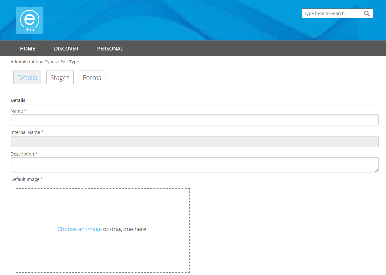
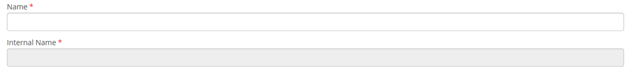
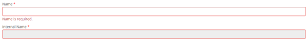
To complete the Details to create a Business Case type ensure all mandatory fields are completed. All mandatory fields are marked with a red asterisk. If the form is saved and a mandatory field has no data in it an error will be displayed on the field when saved.
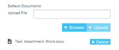
Documents can be included as a default attachment for a business case type when a new business case is created for the type. This is achieved by using the document explorer which opens the file explorer. To delete any attached documents, click the Delete button next to the correct attachment
When all the core details have been added the users can be assigned to specific roles for the Business Case type (Owners, Process Managers, and Readers).

To add a user, enter the name required and once three characters have been entered a search will take place and any matches based on the criteria entered.
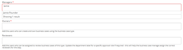
Once the username has been found, select the correct match then click the name to add the user.

The next step for the Details is the Periodic Table configuration.
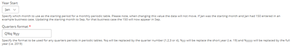
The Year Start option controls what is the starting month for Periodic tables. For example if you wanted the periodic tables for the Type to be set for a calendar year you would select Jan. If you wanted the to start at the beginning of the financial year you would select Apr.
A default currency will have to selected. To select a default currency click on the dropdown which will display a selection of different currencies. Select the desired currency which will be applied to all Business Cases for the type.
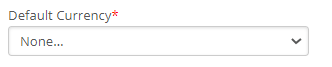
Please note: The currency can be changed for each Business Case on an individual basis.
The final step in the Details configuration are the Power BI Reports. Each Business Case for a Type will include a set of Power BI Reports if configured.

To add a Power BI Report the following will need to be included:
- Title - Name of the Report as displayed in the Business Case UI.
- Report URL - The embed URL stored against the Power BI Report.
- Section - The specific page from the Power BI Report to use.
- Table Name - Table from the Power BI to use.
- Field Name - This should be the field used in the database which the Business Case ID is stored against.
- Order - Placement of the Report in the UI.
The next tab for the Types configuration is the Stages tab.

When first opened 2 default stages will be set for the Draft and Decision stages of a Business Case which cannot be deleted. To add a new Stage click on the Add Stage button which will insert a stage below the Draft stage. Any additional stages will be added below the previously added stage.
Each stage can be configured in various ways which include:
- Name - The name of the stage as displayed in the UI.
- Colour - The colour of the stage banner displayed on the Business Case cards.
- Description - Some further information on the need or use of the stage.
- Status - This indicates the stage the Business Case is in. For the default stages this cannot be changed. For all additional Stages this will be set as Open (general check required) or Under Review (Detailed review required).
- Target Duration in Days - If a value is set and a Business Case is in that stage for a number of days that exceeds the value set the progress bar on the card will change from green to red. If no value is set this bar will always remain green.
- Create Version on Step Change - If a Business Case is moved to a stage this is enabled on a new version of the Business Case will be created automatically.
- Allow Project Creation - If a Business Case is moved to a stage this is enabled on a new button will be added to the Business Case page to create a Project from the Business Case.
- Final Decision Labels - When a Business Case is moved to the Decision stage it can be either Cancelled or Approved which will be displayed in the UI. Changing these values will change what is displayed in the UI.
The final tab of the Type configuration is the Form tab. This is where you select the form to use for the Type.
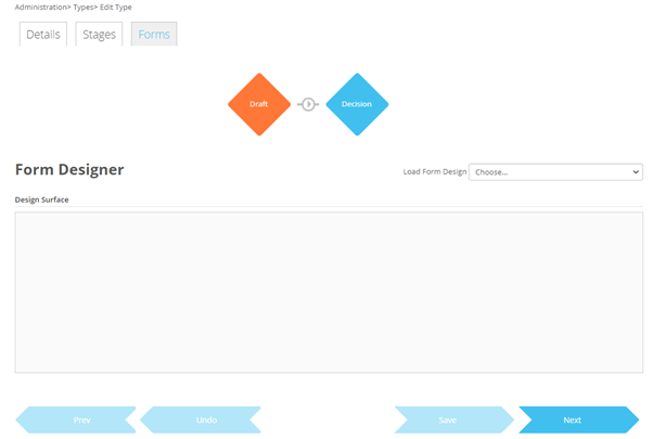
To select a Form Design which was created in the Forms section click on the load Form Design dropdown which will display a list of all the forms created.

Once selected this will include the tabs, fields, tables, and buttons automatically for the type. The next step is to configure the form specifically for the Type. The form can be configured to:
- Include pre-populated data to a field, or table.
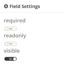
- Set a tab as hidden, read only, or required. This will set all zones, fields or tables in the zone as the selected rule.
- Set a zone as hidden, read only, or required. This will set all fields or tables in the zone as the selected rule.
- Set a field, or table to be hidden, read only, or required.
To set a specific rule for a Tab, Zone, Table, or FIeld click on the cog icon which will open the above. From here click on the option to change which will change the set value.


Pease note any rules applied to a tab, zone, table, or field are only applied to the first stage.
Should the original version of the Form used for a type be updated to have a new tab, zone, table, or field added or an existing option deleted. The changes will need to be accepted for the type. If a change is made the following will appear when the form is opened for the type.

If Yes is selected the form changes will be accepted on the Type and the Type will use the new form layout. If no is selected the existing form layout will be used.
If Yes is selected and the changes are not saved the form will revert back to the previous version. However the Form Template Update message will appear next time the form page is displayed for the type.
Once the accepted changes are saved all Business Cases for the type will use the new form layout.
Back to Home11. News
The Business Case module allows News items to be created and displayed on the Home page of the Business Case application.
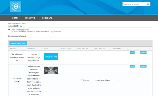
To create a News item click on the Create News Item button. Once clicked the following window will be opened:
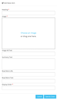
To complete the creation of the news item all mandatory fields (marked with a red asterisk) have to be completed. The fields in the form are as follows:
- Heading* - The name for the news item to be displayed on the Home page.
- Image* - The Image used when viewing the news item on the Home page.
- Image Alt Text – The text used to summarise the image used.
- Summary Text – The main details of the news item.
- Read More URL – If more information is available and accessible via a URL, the URL can be added here.
- Read More text – This is the text that will be used on the Read More button of a News item.
- Display Order* – This is the order the news item will be placed on the news carousel of the Home page.
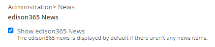
If no News Items are created the default edison365 news will be displayed on the News carousel of the Home page. If at least one news item has been created the default edison365 news can be toggled on and off to be displayed. This can be achieved by adding (to enable) or removing (to disable) the edison365 news.
To edit a news item, click on the Edit button which will display the news item in the Edit News Item window with the data set when creating the News item pre-populated.
To delete the news item, click on the Delete button and confirm the deletion and the news item will be removed from the list and the carousel of the Home page.
Back to Home12. Theme
The Business Case module supports the customisation of the module based on your organisations branding. Allowing the colour scheme, logos, and footer text used to suit the business requirements.
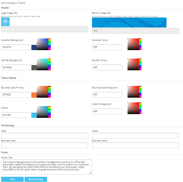
The module can be customised using the options in the Themes page, this includes:
- Logo Image - To modify the Logo hover the cursor just above the grey box in the top right corner of the option which stores the URL where the image used is stored.
- Banner Image - To modify the Banner hover the cursor just above the grey box in the top right corner of the option which stores the URL where the image used is stored.
- Colour Pallet - Changing these will modify the colour scheme of the module. To change them use the colour picker or enter the hex code of the desired colour. The following colours can be changed:
- Suite Bar Background - The banner at the very top where the Admin Console cog is.
- Nav Bar Background - The bar that contains the Home, Discover, and Personal options
- Business Case Primary - Colour of any Business Case elements such as the Create a Case button and the Case Type on a Business Case card.
- Accent - Any additional buttons on the module such as the Save buttons and filter blocks.
- Suite Bar Colour - The colour of the text in the Suite Bar
- Nav Bar Colour - The colour of the text in the Nav Bar.
- Business Case Foreground - The colour of the text in the Business Case elements.
- Accent Foreground - Colour of the text on the buttons and filter blocks.
As well as the colour scheme the terminology used through out the module can be changed.
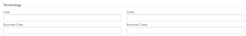
Any text entered in these field will change the wording through out the module. For example if you wanted to call a Business Case a Business Proposal you could enter Business Proposal in the Business Case field. Once saved Business Proposal will be used in the UI instead of Business Case.
The final option is to set the footer text. This is the text displayed right at the bottom of the module. To change this enter your new value in the Footer Text text box.

Once you have completed the configuration of the Theme click the Save button which will set the new look of the module.
Should you wish to revert back to the original theme click the Reset Settings button. Which will revert the theme back to how it looked when first installed.
Caution: Should you click the Reset Settings button this will revert all elements of the theme back to the original. If ever clicked by accident simply leave the page without clicking Save.
13. Notifications
The Business Case module allows notifications to be sent to users once a specific action has taken place. To access the Notifications configuration screen, click on the Notifications tile from the Admin Console. Once accessed the default enabled option will be ‘No’ and the configuration fields will be hidden. When enabled the following will be displayed:
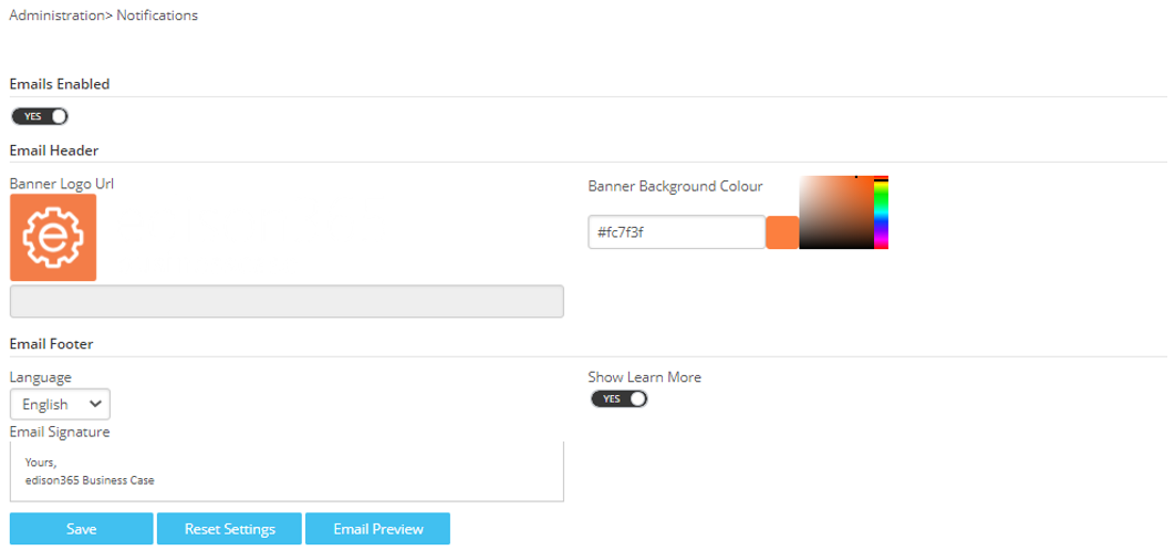
The first option to change is the Email Header specifically the Banner Logo displayed on any email notifications. This can be changed in the same manner as the Theme by hovering the cursor in the top right of the option which will display an edit icon. Click on the icon which will open a file explorer for you to select the correct logo.
Once changed the URL in the grey box will be updated with the new file location.
The next option is the Banner Background Colour. This is the colour of the banner in the email notification. This is changed by using the colour picker or the hex code.
The next area is the Email Footer which contains the main text of the email notification. The first option is the language. This will determine in which language the email notifications will be sent to users.
The next option is the Email signature. This is the text that is displayed at the bottom of all email notifications.
The final option is the Show Learn More switch. If enabled a link will be added to the email and when clicked will be take the user to the edison365 website.
Once you have completed the configuration of the email notifications click on the Save button which will save the current settings for emails.
Should you wish to revert back to the original settings click on the Reset Settings button.
Caution: Should you click the Reset Settings button this will revert all elements of the theme back to the original. If ever clicked by accident simply leave the page without clicking Save.
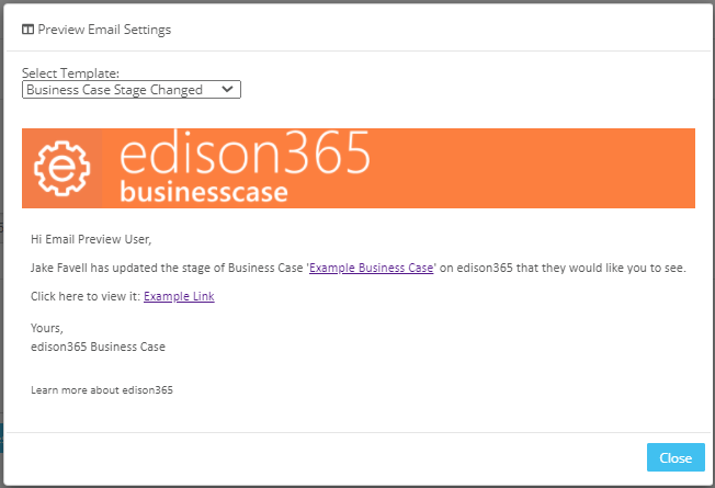
The final button is the Email Preview button. Clicking this will allow you to view how your email notifications will look with the current configuration. This is useful when making changes to how the notifications look as you can see how they appear before saving the changes. Below is an example of an email notification
14. Product Links
Should you also utilise the edison365ideas application a Business Case can be created directly from an Idea. To create a Business Case from an Idea a link will need to be created between both the Business Case module and the edison365ideas application. To create a link click on the Product Links tile of the Admin Console which will display the following page.
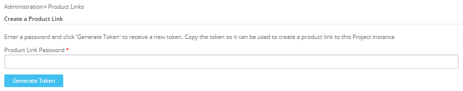
To create a link enter a Password in the Product Link Password. The password is something used only for the linking of the 2 products but has to be remembered. Once the password is entered click on the Generate Token button which will create a one off token.
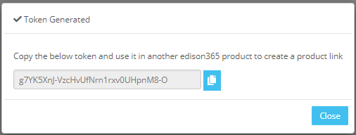
Once the token is generated copy the token and enter that and the password used to generate the token in edison365ideas.
Please see the edison365Idea Administrator Guide for further information on linking both products.
15. Teams
Business Cases can be linked to a Team or multiple Teams in Microsoft Teams. Once linked the Business Case can be viewed and managed in Teams. To enable this feature click on the Teams tile on the Admin Console which will display the following screen:
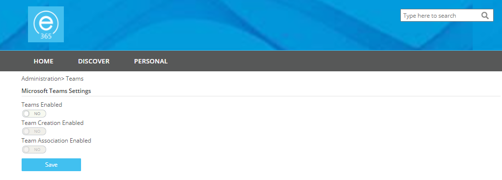
By default the Teams integration will be disabled. To enable the integration the Teams Enabled switch will need to set to Yes.
From here you can either allow users to Create a New Team by enabling the Team Creation Enabled switch. You can also allow users to use existing Teams by enabling the Team Association Enabled option.
If the Teams Enabled switch is set to Yes at least one of Team Creation or Team Association switches have to be enabled. If neither are enabled and you click the Save button the following will be displayed:

To make use of this feature one of the Office 365 tenant administrators will have to first access the following link to authorize the edison365 application in Azure AD if they haven’t done so already for another edison365 product:
Once this link is clicked and access is granted to the edison365 Azure AD Application, this will allow edison365businesscase and Microsoft Teams to work together to on your tenant.
Back to Home16. Yammer (now Viva Engage)
Business Cases can be linked to a Yammer channel on your network to allow users to discuss the Business Case. This must be enabled at a global level before this can be enabled on a Business Case Type and Business Case level. To do this click on the Yammer tile on the Admin Console. Once accessed the following page will be displayed:
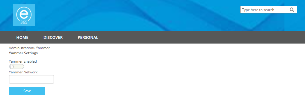
Once the settings have been Enabled as above you need to add your network name that you login to Yammer with in the Yammer Network field. Once saved a Type can now have a Yammer channel assigned to it to start discussions.
Back to Home17. Reports
Reports can be accessed directly through the Business Cases module UI. Multiple reports can be configured to allow ease of access to your reports to support your Business Case needs. To access the configuration, click on the Reports tile on the Admin Console which will take you to the below grid.

The grid will show all the reports configured including a name, Url, the order, and whether accessing the report will be in a new tab.
To configure a new report enter a name in the Title field, the URL of the report in the Link field, if you require the report to be placed in a specific place set the Order (All reports will be set at 0 and placed in order of creation unless stated), the final option is to set whether the report will open in a new tab or not by adding a tick in the Open in New Tab field to open the report in a new tab.
Once the Report information is configured click the Add button which will add the Report to the Reports grid.
To view a report, hover the cursor over the Reports option on the navigation bar which will display the list of reports. Then click on the Report listed to view it in full.

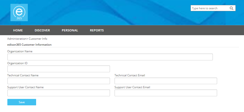
18. Customer Info
The Customer Info page will be used after the Business Case module is first deployed and installed by edison365. This is where you can capture and store information such as your company information, and information from edison365 such as contact details. This will be provided by edison365 when first deployed.